STEP 1: If you are an account admin log in to https://www.weeklypossip.com/login.
STEP 2: From the Welcome Page, click on "Year Insights."
STEP 3: Then select "Contact Insights Dashboard."

If you are an account admin seeking to view this information for a particular account / staff account, go to your "Accounts" tab, select the account you want to view, and then select "Data Quality Dashboard" from the dashboard dropdown menu.
Here's an overview of what you'll find in your Data Quality Dashboard:
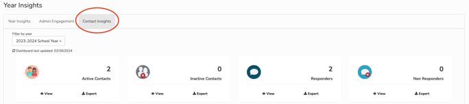
Contact Records
- Active Contact Record: Your contacts receiving Pulse Checks.
- Inactive Contact Record: Your contacts who have either opted out via SMS, unsubscribed via email, or requested to be manually removed. It also includes contacts who cannot be reached due to landline phones, inaccurate mobile numbers or emails.
- Responder: Your contacts who have responded to a Pulse Check this season.
- Non-Responder: Your contacts who have not responded to a Pulse Check this season.
Phone and Email Breakdown
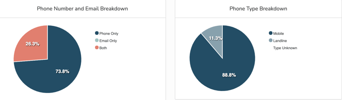
These pie charts represent the breakdown of Pulse Check™ respondent contact data. You can see what percentage of contacts have a phone on file only, an email only, or both. The second pie chart displays the percentage of phone numbers that are mobile or landline.
Language Preference Breakdown
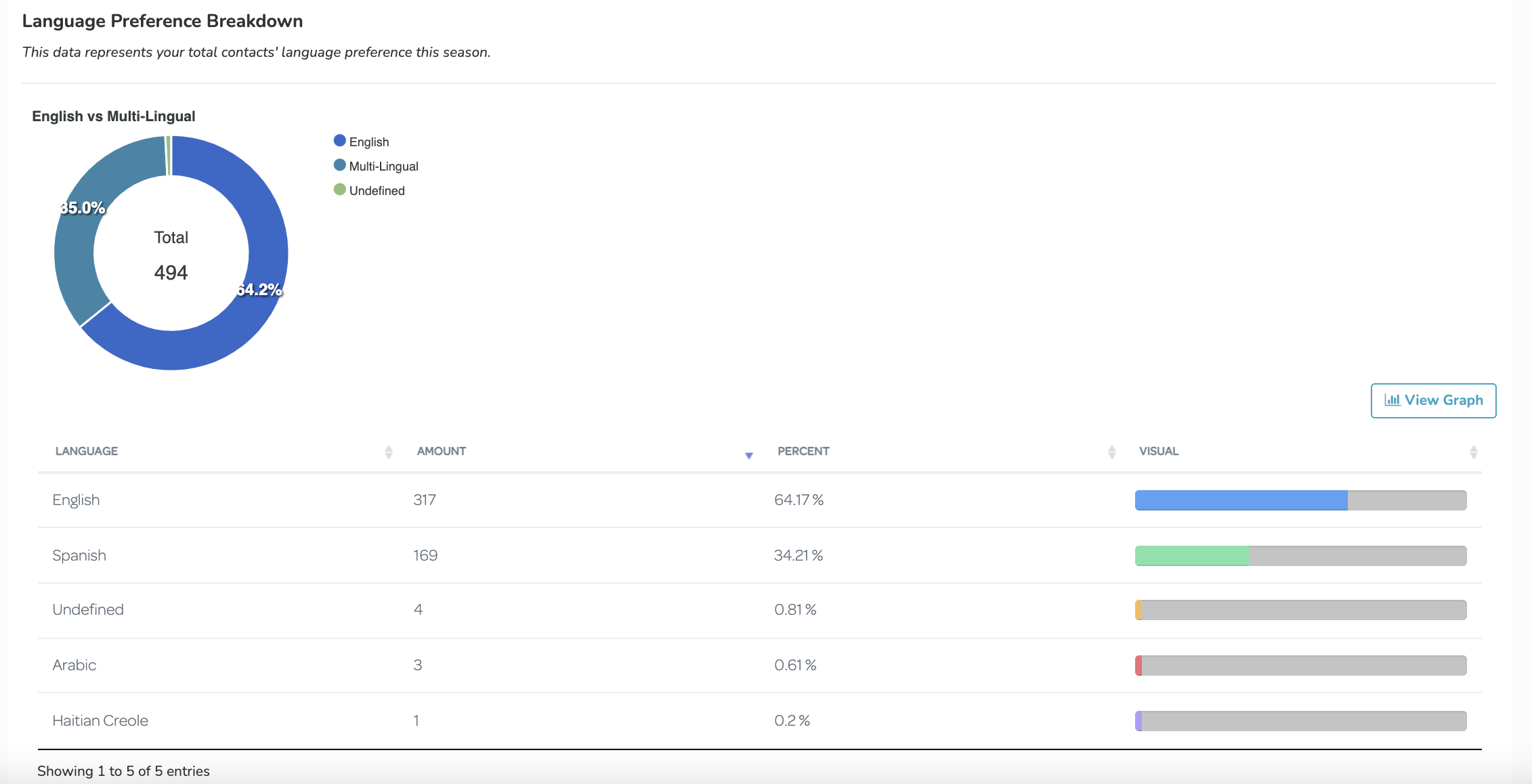
Lastly, you'll notice a breakdown of your contacts' language preferences. You can view theses breakdowns through a pie chart or tree map (which you can access by clicking "view graph"). The preferences are the designated languages listed in the contact sheet provided by you. To view a graph that depicts the language breakdown of people who have actually responded to Pulse Checks™, visit your Year Insights Dashboard. The language of respondents is set based on your contact data, which is another reason we request the language field during import.
Have a question about accessing your dashboard or interpreting the data? Email support@possip.com.