
View the Year Insights dashboard to check out year-to-date insights available now and any time.
The Year Insights dashboard is your resource to easily view insights on engagement and feedback from the year.
If you are a school admin, log in to https://www.weeklypossip.com/login. From the new Welcome Page, click on "Year Insights" to be taken to your new Year Insights dashboard!

If you are a district admin seeking to view this information for a particular school or staff account, go to your "Schools" tab, select the account you want to view, and then select "Year Insights" from the left-navigation bar menu.
Here's an overview of what you'll find in your Year Insights:
Introducing the Sentiment Score™
The Sentiment Score helps you understand how to measure sentiment and parent happiness captured throughout the year. Log in to see your Sentiment Score and learn more about the point system for it. See how your contacts' sentiment is distributed and better understand the numbers behind your score.
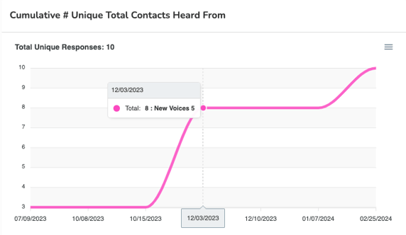
New Voices & Overall Engagement
Learn the numbers and confidently tell the story of growing engagement! The top menu displays a snapshot of engagement:
- How many contacts you're reaching (i.e. Active Contacts)
- How many Pulse Checks® were sent by SMS and email
- How many Pulse Checks were taken by SMS and email
"Cumulative # of Unique Total Contacts Heard From" tells your story of growing engagement - it displays the number of contacts you have reached at any point throughout the year.
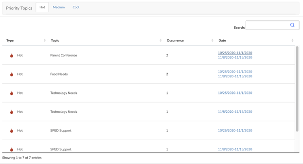
Priority Topics
Priority topics highlight the most frequently mentioned, trending topics for your school or staff this year. Quickly identify categories of needs and opportunities for development. Click on a date to be directed to a Pulse Check™ Report and real comments. Priority Topics can help you summarize feedback from the year and prepare for the future.
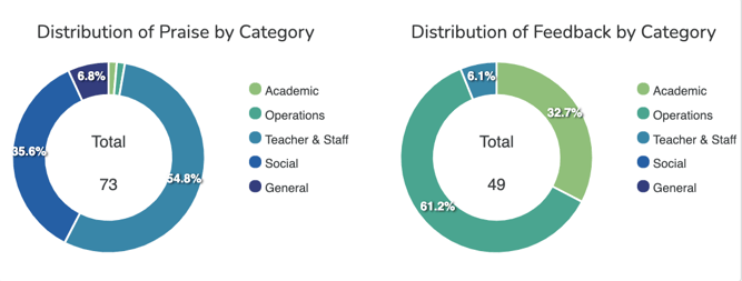
Distribution of Praise & Feedback
Quickly understand what category most comments fall into, and what types of praise and feedback your contacts share.
Languages of Respondents
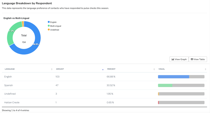
The Language of Respondents represents the language preference of the contacts who have actually responded to Pulse Checks in a particular season. Looking for a visual that breaks down the language demographics of your entire contact list (non-responders included)? View the Contact Insights Dashboard.
If you notice that the map doesn't represent your school's demographics - get in touch and we'll partner to reach more parents in their language of preference!
Contact support@possip.com to review your Dashboard with the CX team.
Want to learn more or have ideas for other stats you would like to see? Possip learns what tools and resources are needed through your feedback. Share your ideas here!