To view the Sentiment Graph with each Pulse Check you've sent:
STEP 1: Log in to https://www.weeklypossip.com/login.
STEP 2: Select "Reports" and click on your most recent report.
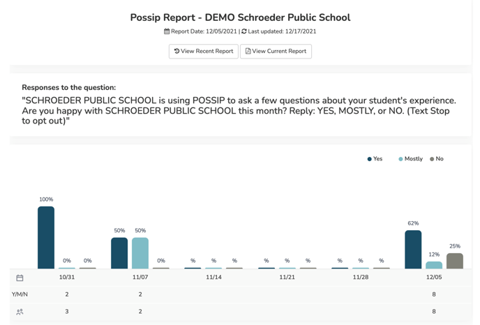
Here's an explanation of the icons below the Sentiment Graph:
- Bars on graph: This is the breakdown of Yes/Mostly/No responses to the Sentiment Question ("Are you happy with [your school] this week/month?") for each Pulse Check®. There are three bars for each Pulse Check: dark blue represents the percentage of Yes responses, light blue represents percentage of Mostly, and brown represents the percentage of No responses you received.
- Calendar icon: Reflects a weekly calendar, displaying when your Pulse Checks were and were not sent. If there is no data under a date, such as November 14th (11/14) above, that means there was no Pulse Check sent that week.
- Y/M/N: Reflects the total number of responders who answered the Sentiment Question.
- People icon: Represents the approximate number of responses you received when the report was published.
When you click on the percentages above the bars, you will be directed to a list of responders who answered Yes, Mostly, or No. In the example above, if you wanted to see who answered Yes on December 5th (12/05), you would click on the 62% value.
To view an aggregate Sentiment Graph in your Year Insights:
STEP 1: Log in to https://www.weeklypossip.com/login.
STEP 2: Click on "Year Insights."

STEP 3: Next, scroll down to view your Sentiment Score™ and your percentages of Y/M/N answers.
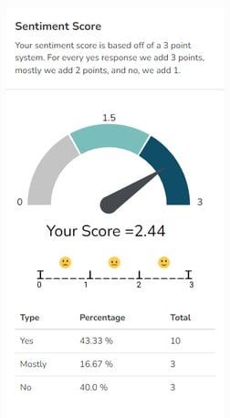
Have questions about your data or Sentiment Score™? Email us at support@possip.com.