Please note: The Possip platform is evolving! This article serves as a log of our feature releases over time and may contain now outdated screenshots and videos. Contact your Customer Relationship Manager if you have any questions about what you see here compared to what you see when you log in to the live platform!
Overview
The Bonus Question Insights Chart graphically displays responses to the Bonus Question in your District Report. Possip uses a powerful combination of machine learning and the expertise of our Possip Reporters to categorize Bonus Question responses and populate the graph.
How to View:
-
Log in to https://www.weeklypossip.com/
-
Click on “District Pulse Check Reports.”

-
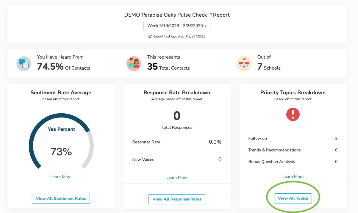
Find the “Priority Topics” panel on the right side of the screen.
-
Click on “View All Topics.”
-
Click on “Bonus Question Analysis” on the navigation bar in the middle of the screen.
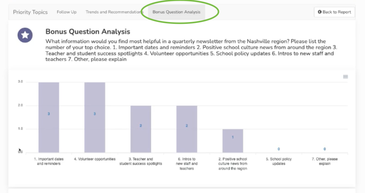
Note: The BQ District graph will only be available to district administrators who asked the same Bonus Question across all schools within the district.
If you have any questions about this process, please send us an email or use our chat!